SPOTIFY · INTERACTION REDESIGN · 2023
Motion/23
Visual
Main tools: Figma · Adobe Premiere
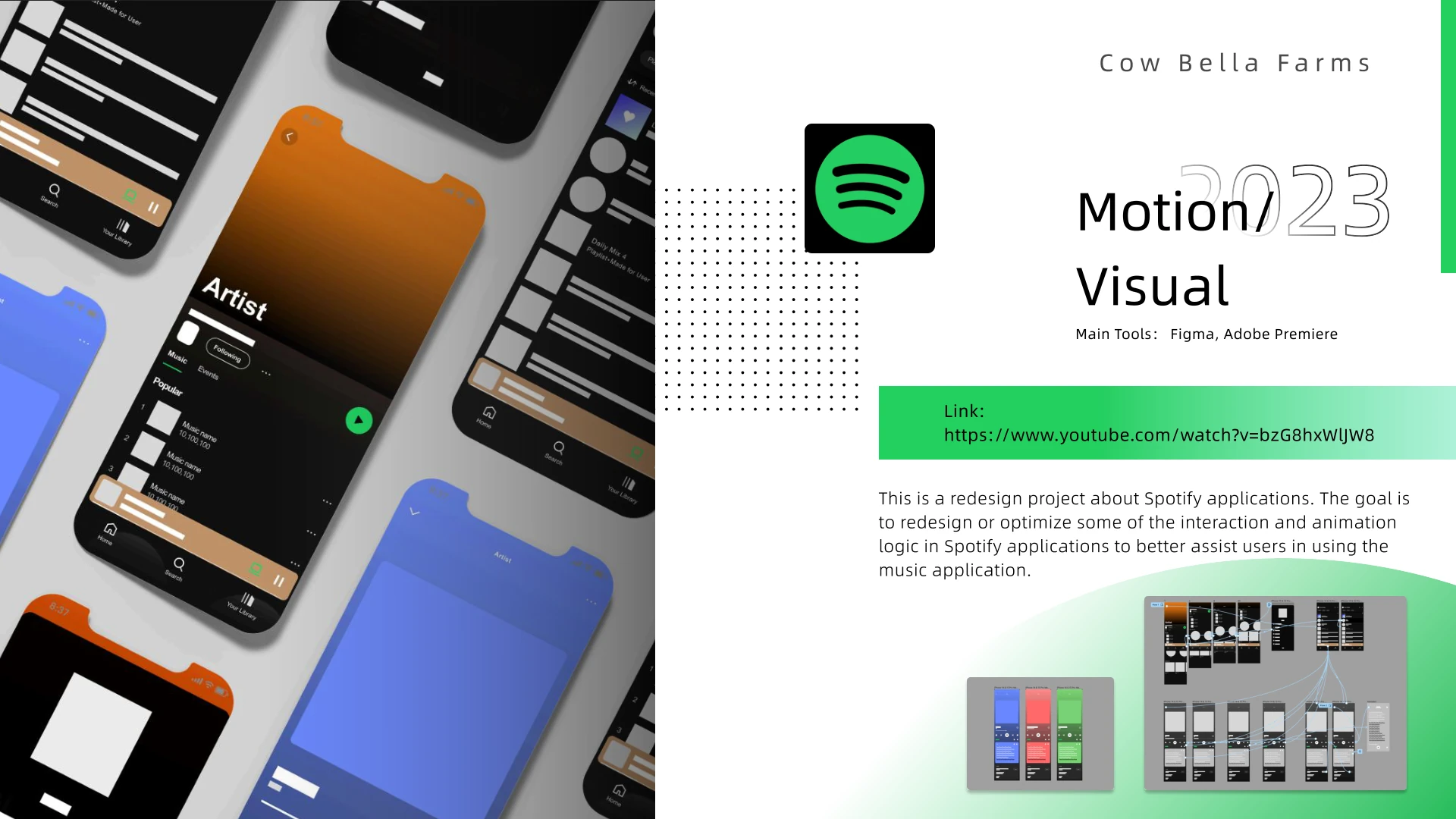
Original project deckOPEN ↗A redesign study for Spotify that clarifies interaction and animation logic, helping listening states feel easier to read and more responsive to the music.
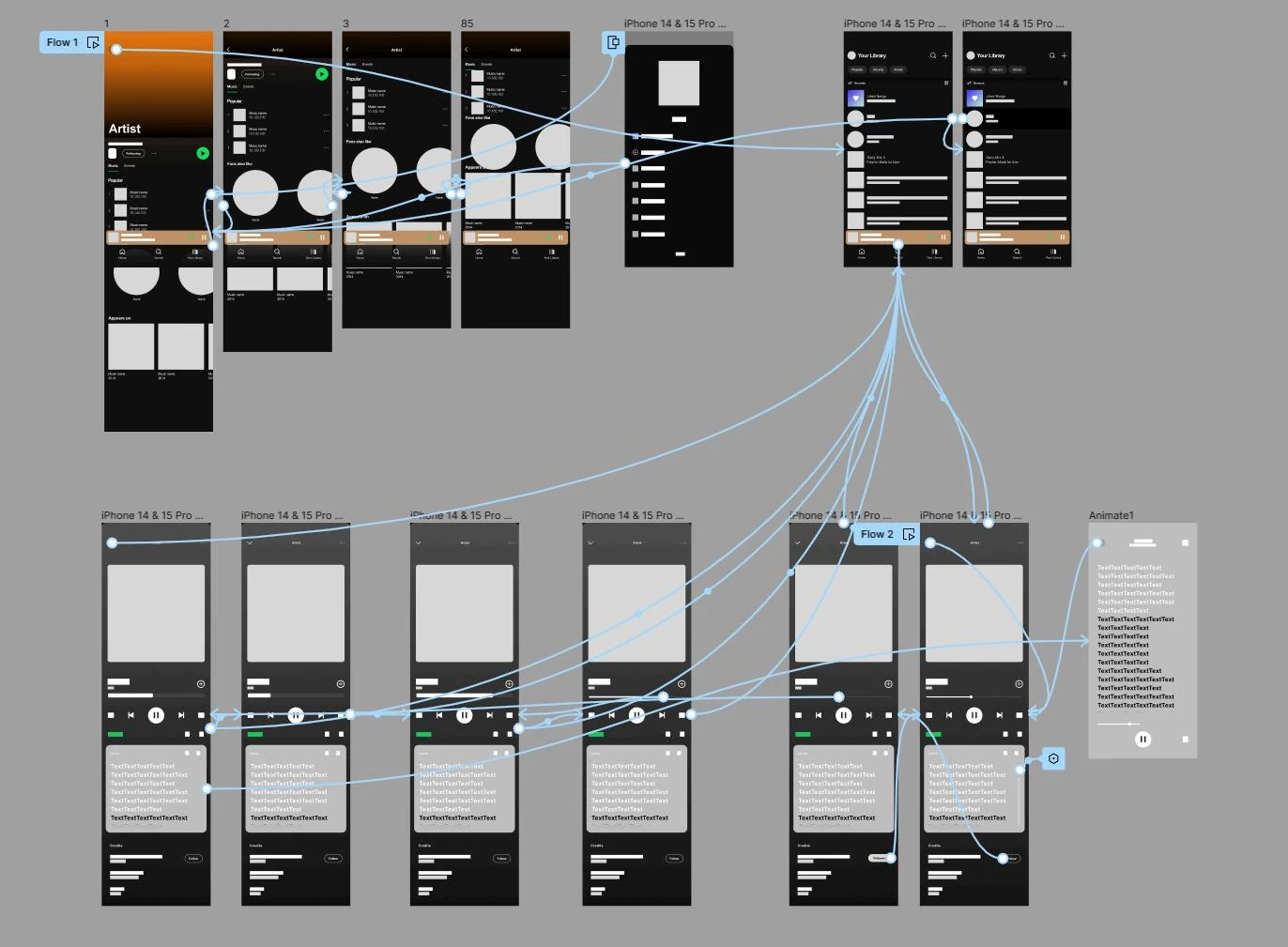
01 / MOTION LOGIC
Motion explains where the interface came from—and where it is going
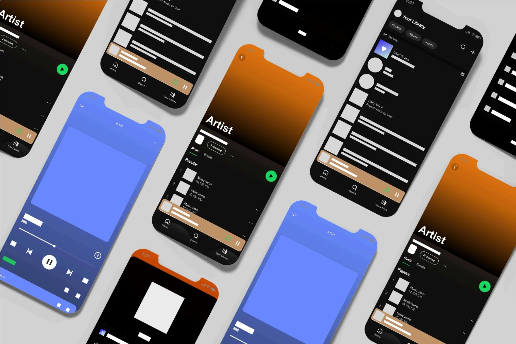
Transitions connect artist, track, player, and library states instead of treating each screen as a disconnected destination.
The system uses directional movement, persistent playback controls, and color continuity to keep the listening context visible while content changes.
02 / COLOR AS STATE
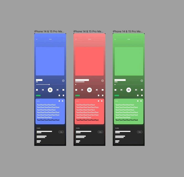
Album-led color gives each listening moment a distinct atmosphere
Blue, red, green, and amber variants test how the same interface can inherit mood without losing Spotify’s black foundation or green action signal.
Large fields of color are reserved for immersive playback and artist moments; navigation and information layers remain high-contrast.
03 / THE ORIGINAL COMPOSITION
The PDF’s split layout becomes the visual system for the page
Back to all projects →