Deliver with integrity
Make information and action feel dependable at every touchpoint.


Brand Strategy · Mobile UI · Academic Project
A mobile brand experience for an affordable-housing organization committed to building homes with long-term social benefit. The design translates Eden Housing's mission into a bold, accessible visual system and a complete prototype.
Affordable housing · Community platform
A vivid system of homes, arches, circles, and paths turns Eden Housing's mission into a recognizable mobile experience.
COMMUNITY · EXPERTISE · HEAD & HEART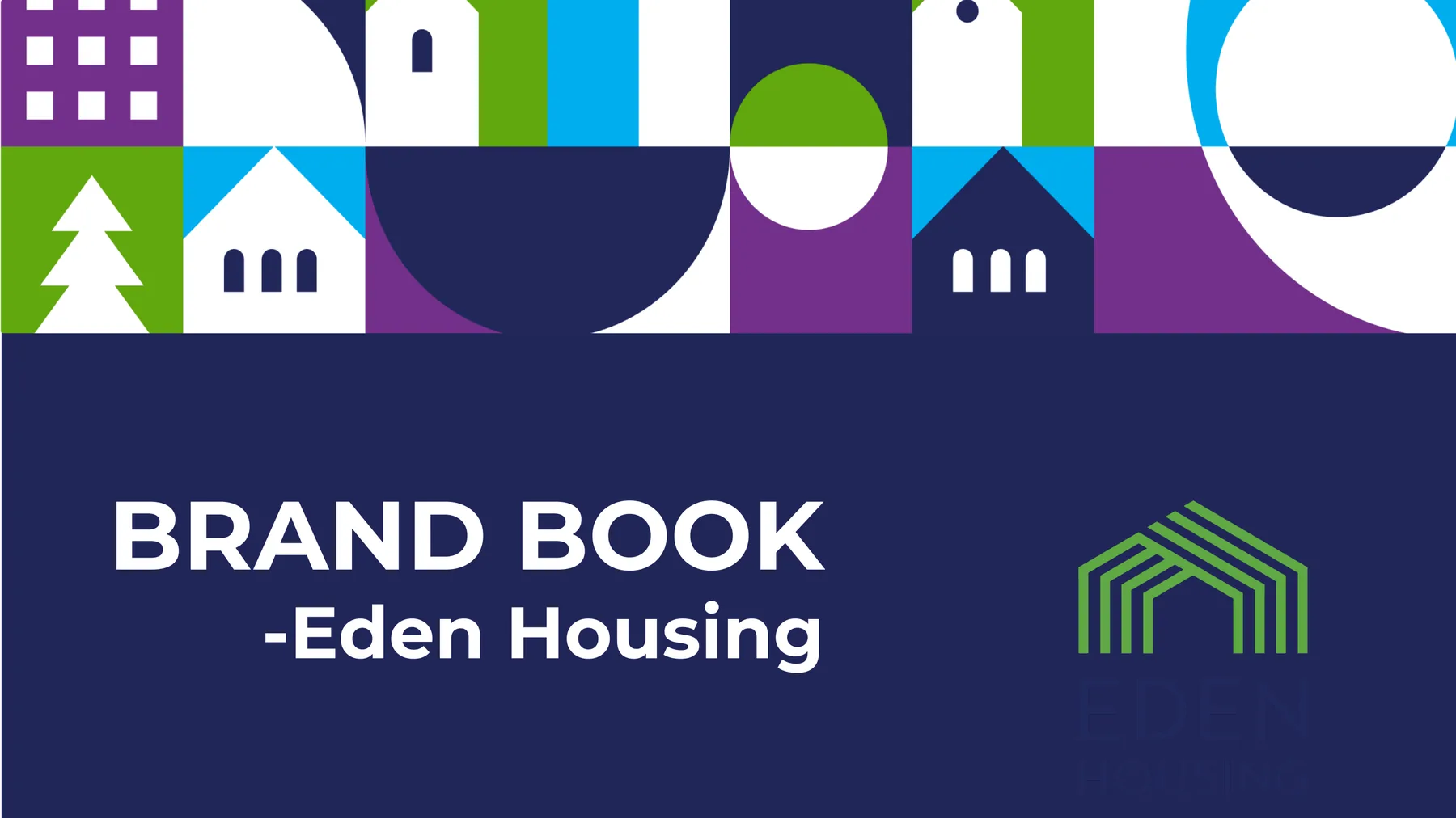
01 · Organization
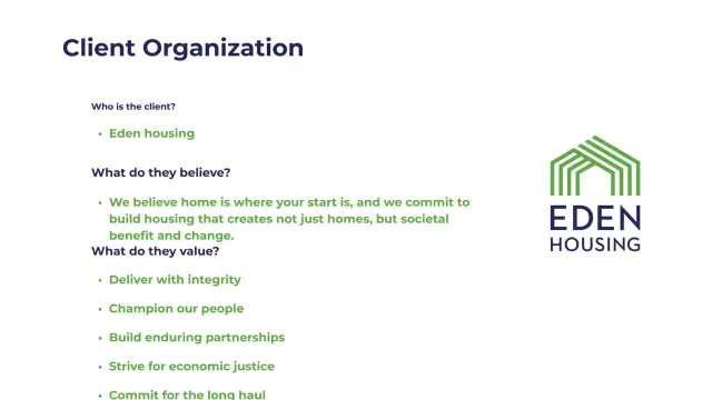
Eden Housing believes a home is where a person's start is. Its commitment extends beyond building units toward creating stability, societal benefit, and lasting change.
The brand direction had to express trust and expertise without feeling institutional or distant.
Make information and action feel dependable at every touchpoint.
Keep residents and community outcomes at the center of the experience.
Communicate clearly across residents, leaders, and financial stakeholders.
Present affordable housing as an enduring investment in economic justice.
02 · Audience & Creative Brief
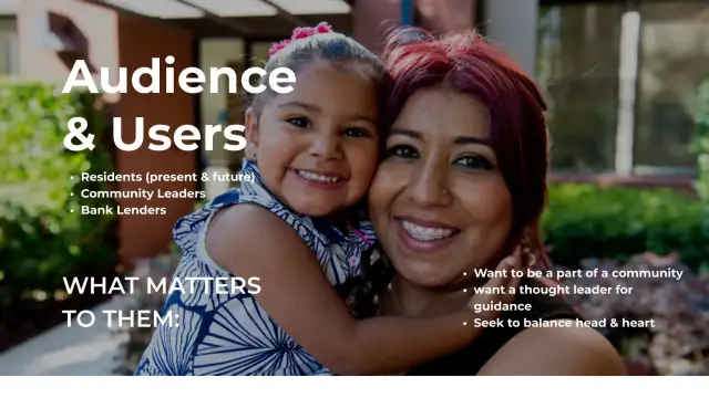
The audience includes present and future residents, community leaders, and bank lenders. They want belonging, informed guidance, and an organization capable of balancing rational decisions with empathy.
Need clear access to homes, events, services, and support.
Look for an experienced partner and a credible source of guidance.
Need confidence that mission, strategy, and execution are aligned.
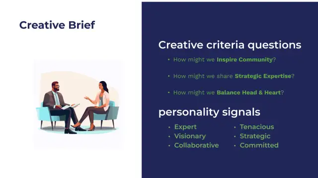
Combine strategic expertise with a visible sense of community.
03 · Visual System
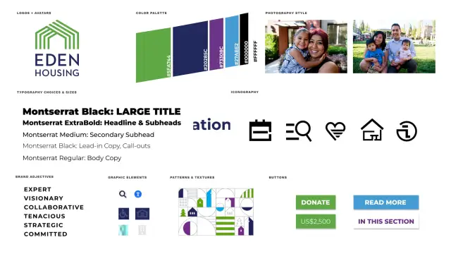
Navy carries credibility, green signals growth, purple adds civic energy, and blue improves contrast across action states. The core pattern recombines houses, arches, trees, circles, and pathways into a flexible neighborhood-like field.
A custom icon family keeps the same heavy geometry across Home, About, Events, Donate, and Search.
04 · Creative Process
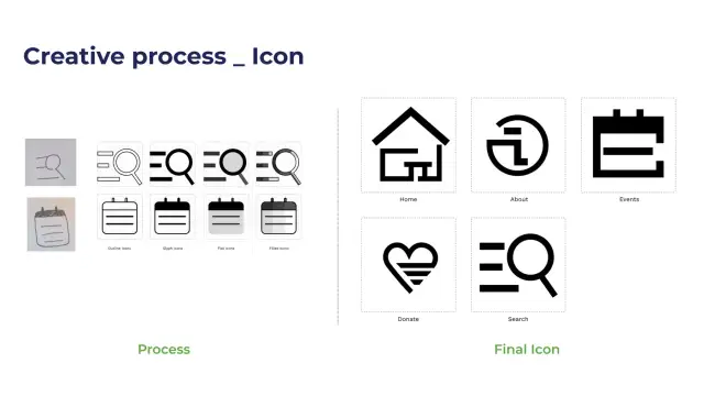
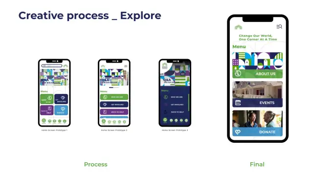
The icon process began with recognizable metaphors, then tested outline, glyph, flat, and filled treatments before converging on a consistent bold-stroke family. Home-screen exploration compared card shapes, information density, color balance, and navigation before the final direction.
05 · Mobile Solution
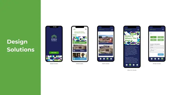
The final prototype applies the brand system across splash, home, events, about, and donation screens. Strong color blocks separate content types, while persistent navigation keeps high-value destinations close.
06 · Outcome
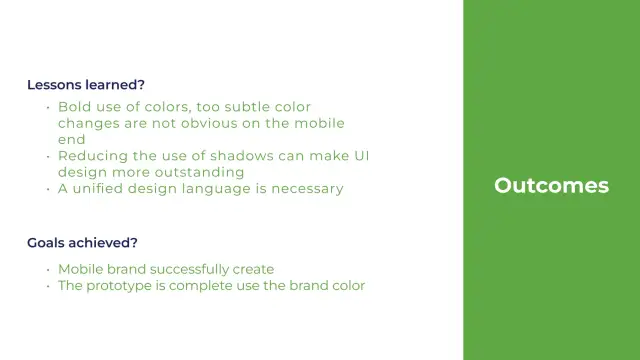
The completed prototype demonstrated that the brand palette and modular graphics could extend into a full mobile experience. The project also surfaced three practical lessons: color changes must be bold enough to read on a small screen, excessive shadows weaken hierarchy, and every component needs to share one visual language.
Brand continuity
Logo, pattern, icons, colors, and typography remain recognizable across every screen.
Mobile contrast
Meaningful color shifts need enough separation to survive on compact displays.
Reduced effects
Fewer shadows let content structure and the graphic system do more of the work.
Unified language
The strongest result comes from treating brand and UI as the same system.
Translate a housing mission into a vivid, usable community platform.