Farm to table
Keep the source of the food visible and make local production part of the promise.


Visual Identity · Digital Experience · Academic Project
A farm-to-table identity built from the ground up for a community-supported dairy farm. The system connects a warm rural character with practical touchpoints for delivery, recipes, farm visits, and community relationships.
Community-supported dairy · Brand system
The visual language makes natural food, family visits, and local cultivation feel like one recognizable CowBella experience.
NATURAL · HANDMADE · JOYFUL · LOCAL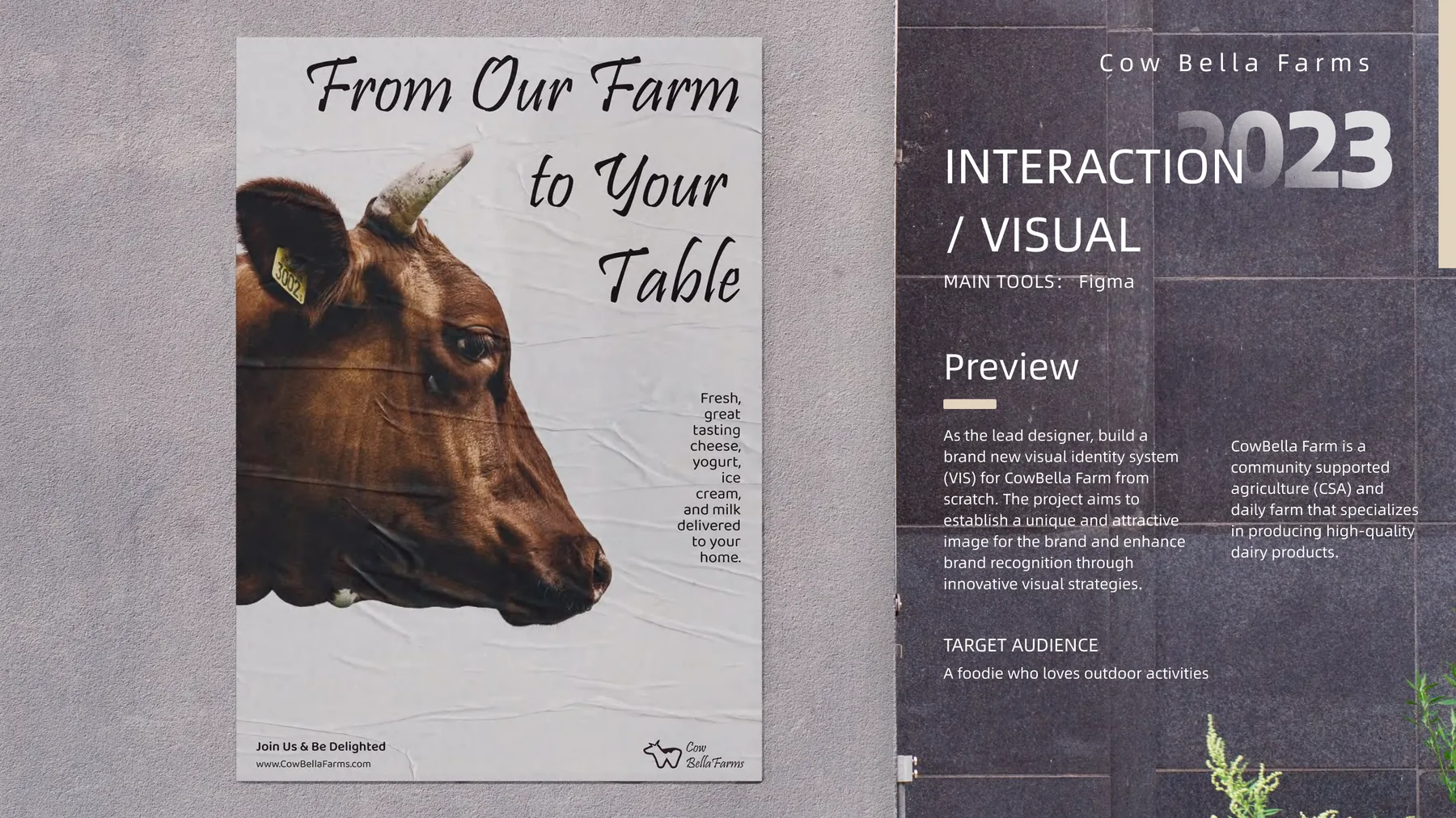
01 · Brand Brief
CowBella Farms is a community-supported agriculture and dairy farm producing milk, cheese, yogurt, and ice cream. The brief asked for a new visual identity that could improve recognition while communicating freshness, care, and direct connection to the farm.
The system needed to work beyond a logo. It had to support discovery in public, build confidence online, and guide people through recurring deliveries, recipes, and farm visits.
Keep the source of the food visible and make local production part of the promise.
Use natural textures and colors without losing clarity across digital interfaces.
Frame delivery, recipes, and visits as ways to participate in the farm.
Carry the same recognition from poster and website to mobile service screens.
02 · Audience & Journey
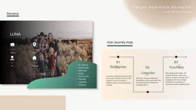
The primary persona, Luna, is a 35-year-old parent looking for healthy, educational outdoor activities with her family. Her journey moves from recognizing a need, to discovering CowBella through a poster, to researching the farm and finally making a purchase and visit.
The audience attributes—natural, handmade, delicious, joyful, friendly, and community-minded—became criteria for both the brand voice and the interaction design.
03 · Visual Language
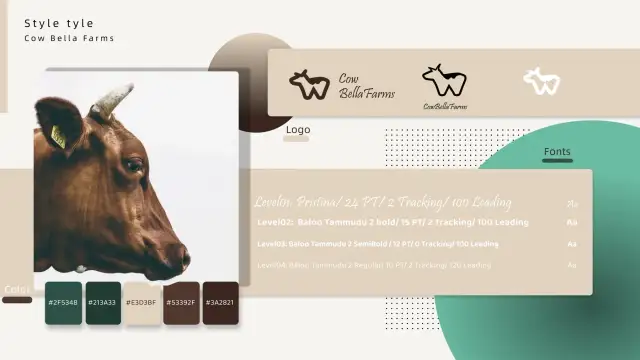
The mark compresses the profile of a cow into a compact monogram-like silhouette. Deep greens connect the identity to agriculture, cream adds warmth, and two brown tones bring in material references from soil, wood, and dairy packaging.
04 · Brand Applications
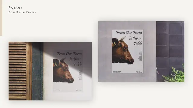
A direct cow portrait and the line “From Our Farm to Your Table” make the source, product, and brand promise readable at a glance.
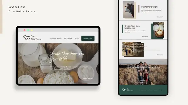
The site introduces deliveries, seasonal recipes, farm visits, and community stories while preserving an editorial, image-led rhythm.
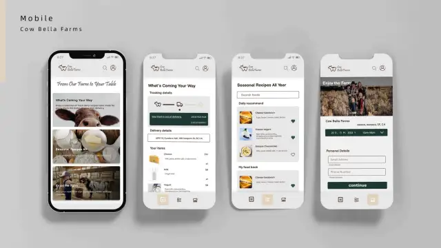
Mobile screens bring the recurring relationship into focus: delivery tracking, item details, recipe saving, and scheduling a farm visit.
05 · Design Outcome
One promise
“From our farm to your table” connects the physical product, local source, and delivery experience.
One visual voice
The mark, earthy palette, portrait photography, and typography repeat without becoming rigid.
Print to product
The identity works at poster scale and remains recognizable inside detailed web and mobile flows.
Community utility
Recipes, visits, stories, and tracking turn the brand from a label into an ongoing relationship.
A warm brand system that brings the farm into every customer touchpoint.